


当然,尽管说不能兼容,可是对于为什么不能兼容还是须要解释一下的,其关键在于这么个选择器的问题:input[type=radio]:before。:beofre这个伪类选择器在主流浏览器中能够在P,span,div等标签插入一些式样,可是在input中就不行,索性chrome支持这一特性,而本实例也正是环绕着一特性进行开发。
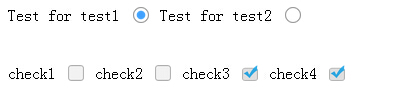
其它不多说,直接上代码和截图。
效果截图:
HTML代码:
<label for="test1">Test for test1 </label>
        <input class="radio" type="radio" ID="test1" name="test" value="test1"/>
        <label for="test2">Test for test2 </label>
        <input class="radio" type="radio" ID="test2" name="test" value="test2"/>

        <br>
        <br>
        <br>
        <label for="check1">check1</label>
        <input id="check1" name="check"  value="check1" type="checkbox" class="checkbox"/>
        <label for="check2">check2</label>
        <input id="check2" name="check" value="check2" type="checkbox" class="checkbox"/>
        <label for="check3">check3</label>
        <input id="check3" name="check" value="check3" type="checkbox" class="checkbox"/>
        <label for="check4">check4</label>
        <input id="check4" name="check" value="check4" type="checkbox" class="checkbox"/>
然后再是CSS代码:
input[type=radio]{
            font-size:1em;
            visibility: hidden;
            position: relative;
            display: inline-block;
            width: 1em;
            height: 1em;
        }
        input[type=radio]:before{
            font-size:1em;
            top:12%;
            display: inline-block;
            position: absolute;
            content:' ';
            visibility: visible;
            height: 1em;
            width: 1em;
            display: block;
            background: url("../img/no.png") no-repeat;
            background-size: 1em 1em;
        }
        input[type=radio]:checked:before{
            font-size:1em;
            content:' ';
            visibility: visible;
            height: 1em;
            width: 1em;
            background: url("../img/yes.png") no-repeat;
            background-size: 1em 1em;
        }

        input[type=checkbox]{
            font-size:1em;
            visibility: hidden;
            position: relative;
            display: inline-block;
            width: 1em;
            height: 1em;
        }
        input[type=checkbox]:before{
            top:12%;
            display: inline-block;
            position: absolute;
            content:' ';
            visibility: visible;
            height: 1em;
            width: 1em;
            display: block;
            background: url("../img/checkbox_no.png") no-repeat;
            background-size: 1em 1em;
        }
        input[type=checkbox]:checked:before{
            content:' ';
            visibility: visible;
            height: 1em;
            width: 1em;
            background: url("../img/checkbox.png") no-repeat;
            background-size: 1em 1em;
        }
本文转自:https://www.cnblogs.com/cynchanpin/p/7224179.html


文章点评